Brew Park

Creating a fun, informative website that generates revenue for an indoor dog park and restaurant

Background

Brew Park is a start-up indoor dog park and restaurant. The primary use of the website prior to the redesign was to get registrations and promote events. Being that it was a novel concept, it was important that we approach the redesign from the perspective of our users who, for the most part, were totally unfamiliar with this type of business.

Results

Before the redesign, lead generation was not prioritized. The business offered private event spaces and birthday party packages but neither service was prioritized. We set out to prioritize these services with the redesign and 7 months post launch we’ve seen some impressive results.

+269%

Private event form conversion rate

+34%

Birthday party form conversion rate

+50%

Job application form conversion rate

12.9x

Website-generated revenue increase

Problem #1: Inconsistent branding

Color palette, fonts, and iconography lacked coherence.

Solution #1: Make branding consistent

Website needed a consistent style guide with colors, fonts, icons, etc.

#1: Make branding consistent

When I began the project, there were 5 different fonts used on the site, too many colors to count, and an overall inconsistency from page-to-page. I knew I had to establish a cohesive style guide before any pages were redesigned. This would not only be strictly followed for the website but for any and all future marketing collateral and campaigns.

Problem #2: Poor usability

Key pages were not optimized to make the user experience simple leading to low conversion rates.

Solution #2: Improved usability

Create compelling pages that educate users and make it easy for them to get in touch.

#2: Improved usability

Pages with the potential to generate business revenue were not given the attention necessary to provide a compelling offer to users. Inconsistent design and a lack of content meant that the solid traffic numbers were meaningless since there were next to no inquiries.

Problem #3: Confusing architecture

Site navigation was bloated and needed re-organization.

Solution #3: Restructure site menu

Cut the amount of links in the site navigation in half and consolidate related information.

#3: Restructuring the site menu

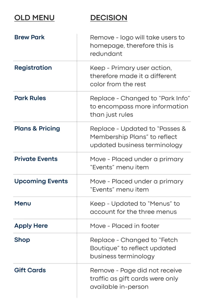
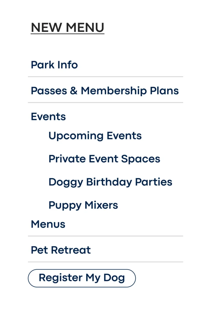
One of the first steps toward redesigning the site was to restructure the site navigation. Data from Google Analytics and conversations with employees & customers led to the new navigation. Data highlighted pages with the most and least traffic as well as corresponding exit rates. For instance, a page like “Gift Cards” had the lowest traffic of any page, an above average exit rate, and next to no conversions, therefore, we decided to cut it from the navigation.

Problem #4: Thin content

Content lacked depth of information which was key for educating people about this new business concept.

Solution #4: Thorough content

Write much more content on high-traffic, informational pages such as the homepage, registration, park info, etc.

#4: Thorough content

When I began the project, there were 5 different fonts used on the site, too many colors to count, and an overall inconsistency from page-to-page. I knew I had to establish a cohesive style guide before any pages were redesigned. This would not only be strictly followed for the website but for any and all future marketing collateral and campaigns.